
Choosing the Right Color Palette for Your D.C. Office Space
Last Updated: May 31, 2024
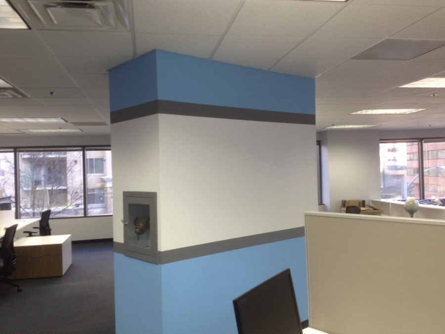
When redesigning your office space, selecting the right color palette is more than just an aesthetic choice—it's a strategic decision that can influence everything from employee wellbeing to productivity in the workplace.
Why is it such a big deal?
The colors that surround us have a profound impact on our mood and energy levels, making it essential to choose wisely for a professional environment. Today, let’s get strategic, looking at tips and strategies for making the most of your next office paint job.
Understanding Color Psychology
Color psychology plays a crucial role in setting the tone of your workspace. Each color can evoke different emotions and reactions. For example:
-
Blue is often associated with stability and calmness, making it ideal for high-pressure environments.
-
Green represents balance and can encourage a sense of tranquility and health, suitable for spaces that require concentration and calm.
-
Yellow stimulates energy and creativity, perfect for dynamic, creative teams that thrive on innovation.
-
Red can increase energy levels and is best used in areas that benefit from high activity but should be used sparingly due to its potential to raise anxiety levels.
Who knew colors could make such an impact!
Assessing the Needs of Your Office
To choose the right colors for your office, consider the primary functions of each space. For example, creative teams might benefit from the vibrancy of yellows and oranges, which foster creativity and enthusiasm. In contrast, areas designated for serious work and concentration, like legal or financial departments, may benefit from cooler hues like blues and muted greens, which help maintain focus and reduce stress.
Tips for Choosing a Color Palette
When it comes to selecting a color palette, consider both the size of the space and the available lighting. Small spaces benefit from lighter colors that make the room feel larger and more open. Large spaces on the other hand can handle darker or more saturated colors that might overwhelm smaller rooms.
Just remember, always test paint colors in the actual environment where they will be used. Hang paint swatches on the walls to observe how different lighting conditions affect the appearance at different times of the day. Digital tools can also help visualize the space before making final decisions.
Maintaining Aesthetic Coherence
Unlike painting homes, one of the goals of office painting is to achieve a professional and cohesive look by maintaining consistency in color usage across different rooms and areas. Decide on a base color for common areas and select complementary colors for private offices and meeting rooms. This strategy helps create a unified look while allowing room for variation based on specific department needs or preferences.
What's the Takeaway?
As you can see, choosing the right color palette for your office requires careful consideration of both aesthetic and psychological factors. By understanding the impact of colors and assessing your office's needs, you can create a space that not only looks good but also encourages the productivity and wellbeing of everyone who uses it!
Need More Advice? Contact Williams Professional Painting
Offices are busy places, and a new paint job (even a small one) requires a lot of moving parts. The good news is that it doesn’t need to be stressful or disruptive! Williams Professional Painting is your trusted DC Painting company, with services reaching across the nation. Contact us today for more information.
Frequently Asked Questions
Q: How often should office colors be updated?
Office colors don't need frequent changes but consider updating the palette every 5 to 7 years to keep the environment fresh and engaging.
Q: What are the best colors for high-stress environments?
Blues and greens are excellent for high-stress environments as they tend to be calming and reduce anxiety.
Q: Are there colors that should be avoided in office settings?
Bright reds and oranges can be overwhelming if used extensively; they are best used as accent colors.
Q: How can I make a small office space look bigger with color?
Use light colors like soft whites, pale blues, or greens, which reflect more light and give the illusion of more space.
Q: Can brand colors be effectively integrated without overwhelming the space? Yes, incorporate brand colors through accents and accessories rather than wall colors to maintain professionalism without overpowering the space.
Related Posts