Why Commercial Paint Colors Matter
Last Updated: January 28, 2025

You know when you turn on a movie and you can almost instantly tell what kind of mood it's going to strike? That's intentional! There's a carefully selected color palette and tone chosen by the producers for that very purpose.
But the reality is, color is everywhere, and it's constantly influencing how we feel, act, and even think. Which means, in the world of commercial spaces, your choice of paint color is far from a minor detail–it’s a strategic decision that impacts everything from customer impressions to employee productivity.
Let’s take a closer look.
The Iconic School Bus Yellow
The official color name is actually "National School Bus Glossy Yellow", and it's a great example of how thoughtful color selection serves a purpose far beyond aesthetics ( read the full article here by HowStuffWorks). In 1939, Dr. Frank Cyr, often called the “Father of the Yellow School Bus,” led a conference that standardized school bus specifications, including the now-iconic color.
Why was this specific shade chosen? Two reasons:
High Visibility: Yellow is one of the most eye-catching colors to the human eye. It’s visible in low-light conditions like early mornings and late afternoons, times when buses are most active. Compared to other colors, yellow is also more noticeable in peripheral vision, reducing the likelihood of accidents.
Psychological Impact: Yellow is also universally associated with caution and alertness. It subconsciously (and consciously) signals drivers to slow down and proceed carefully, reinforcing the safety of school children.
The Psychology of Colors in Commercial Spaces
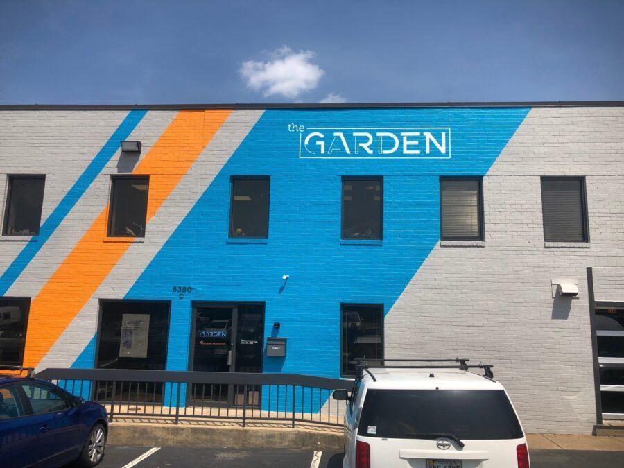
The right palette can be so powerful, businesses across industries use carefully chosen colors to convey their brand identity and create the right atmosphere. Just to name a few examples:
-
Red stimulates energy and urgency, making it a popular choice for sales signs and fast-food restaurants.
-
Blue fosters trust and calm, ideal for healthcare facilities and corporate offices.
-
Green is often associated with nature and eco-friendliness, commonly used by sustainable brands.
Each color evokes a different psychological response, and choosing the right one can support a space's purpose, from energizing shoppers to calming patients.
Why Paint Colors Matter for Your Businesses
Whether you’re managing a retail store, an office, or a healthcare facility, the colors you choose will influence how people perceive and interact with the space.
First Impressions and Branding
Colors are often the first thing people notice about a business. A well-chosen palette can instantly convey professionalism, trustworthiness, or creativity. Think of how the biggest fast-food restaurants use colors like red and yellow to evoke energy and hunger or how tech companies often use shades of blue to communicate reliability and innovation.
Enhancing Productivity and Comfort
But it's not just about customers. For employees, the right colors can boost morale and productivity and an overall more enjoyable workspace. Research shows that:
-
Cool tones like blue and green promote focus and calm, making them ideal for offices.
-
Warm tones like yellow and orange can spark creativity and energy, perfect for collaborative spaces.
Guiding Customer Behavior
Paint colors can also subtly direct how customers interact with a space. For example:
- Retail Stores: Contrasting colors are a staple in retail environments. Bright reds and yellows on sales signs are attention-grabbing and convey urgency, encouraging customers to take immediate action. Bold accent walls or strategically placed pops of color are another way you can highlight key products or promotions and even direct foot traffic through the store.
- Spas and Wellness Centers: On the other hand, businesses focused on relaxation and rejuvenation often lean on soft, neutral tones. Gentle shades of beige, sage green, or lavender create a calming atmosphere, putting customers at ease and promoting a sense of tranquility. This deliberate use of color aligns with the brand’s purpose, ensuring the environment feels welcoming and restorative.
Do You Need Help with Strategic Paint Colors?
For over 46 years, Williams Professional Painting has served a wide variety of clients and industries. Contact us today to discuss your specific needs and goals.
Related Posts