
Back to School Painting: Creating a Study Place in Your Home

To be honest, few people look forward to studying and doing their homework, and some people outright dread it! But the space that you study in has a large impact on how pleasant and effective your studying is. If you’re studying in a cluttered, messy room, or a room with lots of distractions, it can be very hard to concentrate! However, if you’re studying in a calm, organized room, you can be much more productive.
With that in mind, here are some painting suggestions for a study area in your home:
Great Interior Painting Options:
Blue – Peaceful and Productive
Blue is a beautiful color, and it is very calm and soothing. Blue also stimulates productivity by aiding concentration, which makes it a great interior color option for a study place. Blue is often used in bedrooms anyways, so if the study place is in a bedroom, it works very well.
One caution is to avoid shades of blue that tend towards drowsiness (unless you want to be falling asleep while studying!). Blues that contain energetic undertones, such as turquoise or teal, might be the best options. If your favorite shade of blue is very bright, you could just do one accent wall that shade and do the rest a more neutral blue.

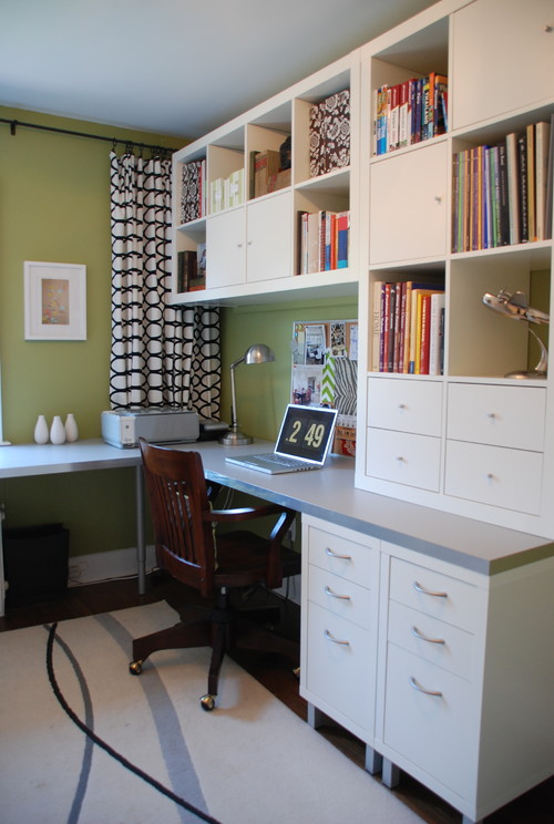
Green – Calm and Refreshing
Similar to blue, green is a nice cool color that will help a room feel restful. The right shade of green, though, can be very energizing and help concentration for studying. A mossy green might be a great option, but if you have a larger room and want to do an accent wall, a lime green would be a good choice.
Yellow – Energizing and Cheerful
Yellow is a very energizing color (think sunshine or lemon!), and it can help maintain energy and freshness during long hours of studying. If the study space in question is a bedroom, you will probably not want a very bright shade - maybe a nice buttery yellow, soft enough to allow a good night’s sleep. For a different room, though, you could go with a deeper yellow like dandelion, or even a very bright yellow like lemon.
As we mentioned above, you may way to just paint an accent wall in your study area using a bold color like yellow, and use a more neutral color in the rest of the space.
Interior Colors to Avoid:
Red – Stressful and Overstimulating
Especially if your study place is in your bedroom, avoid red. It is associated with stressful events, like red pen marks on your essay, or red lights in traffic. If you really want a red color, you could either do a very deep, maroon-red, or a pale pink; these are both in the same family without being nearly as stressful.
Orange – Chaotic and Distracting
Orange is a very nice color for some things, but for your study place is definitely not ideal. It is a distracting color, and one that is used on many danger and construction signs; definitely not a good choice for productive concentration! Yellow is close to orange on the color wheel, but is an ideal color for your study spot.
Tidiness is Key!
Tidiness is definitely vital to how pleasant a study area is! If your study area is crowded, it will be much more distracting (not to mention hard to keep track of supplies and assignments). Keep you space organized! Keep your books on a book shelf, neatly label binders, and so on.

Personalize It!
We’ve given suggestions for what paint colors are conducive for your study room, but its important to choose what you like. Every person is unique, and so are their study needs and habits! So, make you study space organized, make it pleasant, make it fun, and make it your own!
Just Can’t Decide? – Call Williams Professional Painting!
If you just can’t decide what color would be best for your room, or if you need help picking out the perfect shade, Williams Professional Painting Company would be glad to help you. We offer expert color consultation at our design center, and we can, of course, also do the painting! So, if you want a beautifully-painted study area, you can call Williams Professional Painting or click here to schedule a free estimate today!